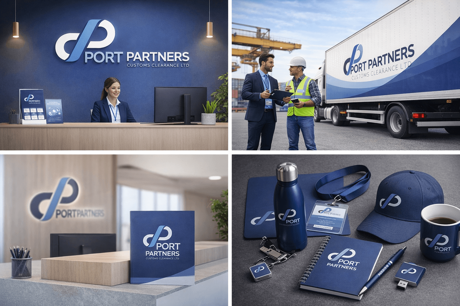
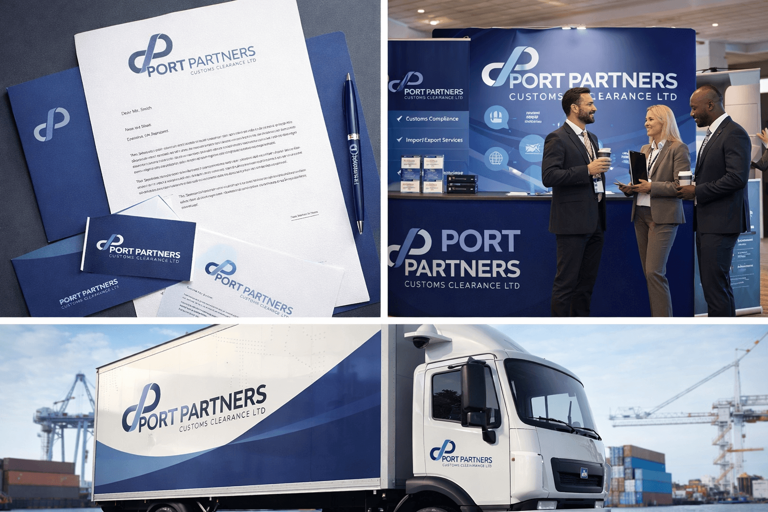
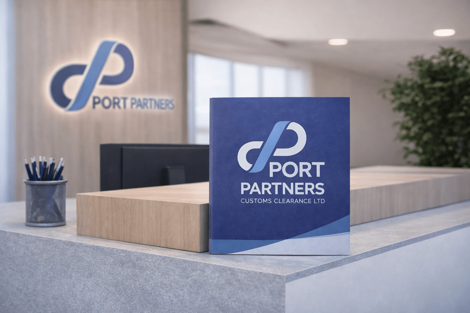
Port Partners
A distinctive brand identity for a customs clearance specialist, designed to represent seamless flow and infinite possibility.
Client
Port Partners
Role
Brand Identity Design
Deliverables
The Challenge
Port Partners needed a brand identity that would communicate their expertise in customs clearance whilst standing out in a traditionally corporate industry. The mark needed to convey both their operational precision and their ability to navigate complex logistics challenges.
The Solution
The brand mark embodies the essence of their service through clean, purposeful geometry. The continuous line represents the seamless flow of goods through customs—in and out—whilst the infinity symbol speaks to their unwavering commitment to making the impossible possible.
The identity system balances professionalism with approachability, using a refined colour palette and contemporary typography that positions Port Partners as forward-thinking specialists in their field. Every touchpoint, from business cards to signage, reinforces their message of continuous, reliable service.